

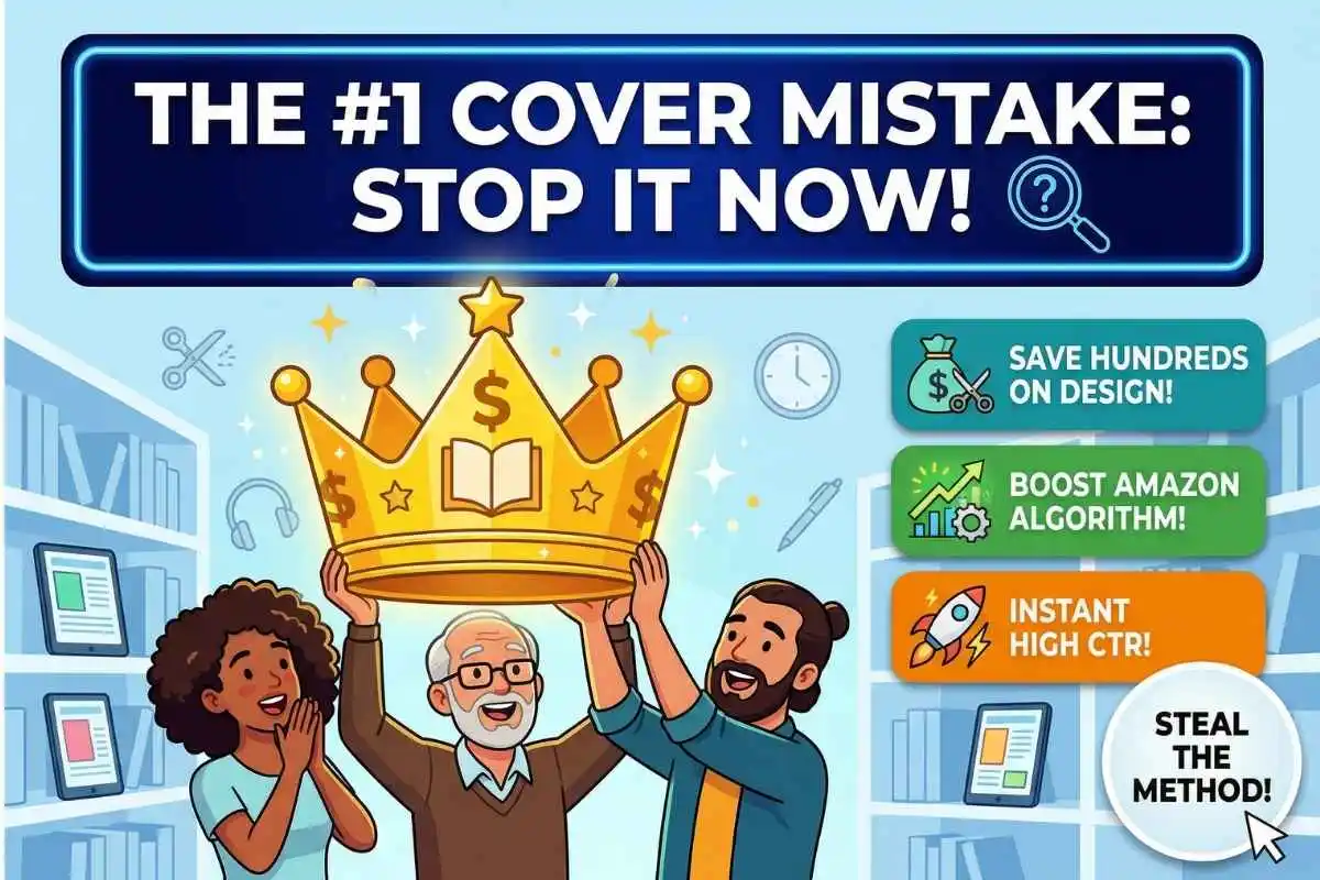
Imagine walking into a massive, sprawling bookstore that stretches infinitely in every direction, filled with millions of books fiercely competing for your immediate attention. Now, imagine you are sprinting through the aisles of that bookstore, only giving each book a fraction of a second of your time before moving on. This scenario is exactly what happens every single day in the digital storefront of Amazon. Independent authors who self-publish pour their hearts, souls, and countless hours into writing their manuscripts, but when it comes time to package that art, they often make a critical, sales-killing error. They try to tell the entire complex story on the front cover, stuffing it with the protagonist, a looming castle, a dragon, multiple fonts, and heavy borders. The result is a chaotic visual that industry insiders call the “too busy” mistake. In today’s highly competitive digital marketplace, a cluttered cover does not invite readers in; it pushes them away. Instead, a quiet design revolution is taking place where clean, minimalist graphics are completely dominating the sales charts, proving that sometimes, doing less is the exact strategy you need to sell more.
The Crucial Psychology of the Mobile Thumbnail
When avid readers browse for their next great story on their smartphones or tablets, they aren’t looking at a full-sized, six-by-nine-inch physical paperback. They are looking at a compressed digital thumbnail that is barely an inch tall on their screen. At this microscopic size, a complex, beautifully detailed illustration immediately turns into a muddy, unrecognizable blob of dark colors. The carefully chosen title, squeezed between a wizard’s glowing staff and a sprawling galaxy, becomes completely illegible to the human eye. Minimalist KDP designs, on the other hand, are engineered specifically from the ground up for this mobile-first shopping experience. By utilizing striking negative space, a single central focal point, and large, bold typography, these clean covers stand out brilliantly against the stark white background of the Amazon app. When a potential buyer is scrolling rapidly through thousands of search results, a minimalist cover acts as a powerful visual stop sign. It does not ask the exhausted reader to squint or work hard to understand what the book is about; it simply delivers a clear, instant, and undeniable message. This immediate visual clarity is the very first step in converting a casual, scrolling browser into a loyal, paying customer.
Combating Cognitive Load and Decision Fatigue
The massive success of minimalist covers is not merely a subjective, passing design trend; it is deeply rooted in human psychology and the biological way our brains process visual information online. Every single time a consumer looks at a new image, their brain has to actively decode the visual data presented to them. When a book cover is packed tightly with too many characters, competing neon colors, and intricate background details, it drastically increases the viewer’s Cognitive load. This psychological term refers to the total amount of working memory resources used during a specific task. If a product demands too much mental effort to decipher, the human brain simply gives up to conserve energy and moves on to the next available option. Minimalist designs elegantly bypass this biological hurdle by offering a visually soothing experience that requires almost zero cognitive effort to instantly digest and understand. A single, evocative object—like a lone blood-stained dagger on a pure white background for a thriller, or a single bright yellow umbrella against a dark, rainy cityscape for a mystery—sparks deep curiosity without causing sensory overload. By intentionally reducing the visual noise, minimalist covers allow the core emotional hook of the story to resonate instantly with the reader’s subconscious.
The Cost and Time Efficiency of Doing Less
Beyond the profound psychological advantages for the browsing reader, minimalist cover designs offer incredible practical and financial benefits for the independent publisher. Creating a highly detailed, custom-illustrated fantasy or science fiction cover from scratch can easily cost an author hundreds, if not thousands, of dollars in freelance fees. For a new, unproven writer who is just starting their journey on Kindle Direct Publishing, spending a massive chunk of their limited launch budget on a complex cover is a tremendous financial risk. Minimalist covers, conversely, are significantly more cost-effective and much faster to produce at a highly professional level. An author can legally purchase a high-quality, high-resolution stock photograph or vector graphic, pair it with premium commercial typography, and create a stunning cover for a mere fraction of the traditional cost. This certainly does not mean the design process is easy—choosing the perfect font weight and perfectly balancing the negative space requires a highly refined artistic eye—but it does mean that authors have the freedom to test different covers without facing bankruptcy. Furthermore, a clean, simple design allows for incredibly easy adaptation when creating a long-running series, allowing the author to maintain strong brand consistency by just swapping out a single color or icon.
Pleasing the Algorithm with Higher Click-Through Rates
To truly understand why these minimalist KDP covers are consistently outselling their complex counterparts, we have to look closely at the invisible, mathematical force that governs Amazon’s entire ecosystem: the search algorithm. Amazon’s primary, overriding goal is to sell as many products as possible, and its algorithm relies heavily on a vital metric known as the Click-Through Rate (CTR). When a book appears in a prospective customer’s search results, Amazon meticulously tracks whether or not that customer actually stops to click on the listing. Because minimalist covers are highly legible, emotionally evocative, and visually striking at thumbnail size, they naturally attract a significantly higher number of initial clicks than cluttered covers. When Amazon’s machine learning systems see this consistently high CTR, the algorithm interprets the data as a strong signal that customers are genuinely interested in purchasing the book. As a direct reward, the algorithm pushes the book much higher up in the organic search rankings and features it far more prominently in the highly coveted “Also Bought” recommendation sections. This creates a powerful, self-sustaining snowball effect where clean design leads to clicks, clicks lead to algorithmic favor, and algorithmic favor translates into massive sales.
Honoring Genre Conventions Through Simplification
It is incredibly important to acknowledge that adopting a minimalist cover strategy absolutely does not mean abandoning the established, beloved visual conventions of your specific literary genre. Romance readers still expect certain distinct visual cues, just as hardcore thriller readers and non-fiction self-help readers do. The true magic of modern KDP minimalism lies in cleverly distilling those complex, age-old genre tropes down to their absolute, most potent, and easily recognizable essence. For example, instead of a bustling, chaotic spaceship battle featuring countless lasers, planets, and alien species for a massive science fiction space opera, a brilliantly minimalist cover might feature a single, sleek astronaut’s visor reflecting the violent explosion of a dying star. Instead of a passionate, full-body embrace in a crowded Victorian ballroom for a historical romance novel, it might feature a solitary, elegantly gloved hand gently holding a single, slightly wilted red rose. By smartly isolating the single most powerful symbol of the story, the cover communicates the exact tone and promise of the genre while maintaining a flawlessly clean, premium aesthetic. This highly targeted approach ensures that the book consistently attracts its core target audience, but it achieves this with a level of sophistication that a busy cover simply cannot match.
Data Comparison: Complex vs. Minimalist Covers
| Feature / Metric | Complex Cover Design | Minimalist Cover Design |
| Visual Elements | Multiple characters, detailed backgrounds, heavy textures | Single focal point, vast negative space, clean lines |
| Thumbnail Legibility | Very Poor (details become blurred and unreadable) | Excellent (image and typography remain highly distinct) |
| Cognitive Load | High (requires effort to understand the book’s premise) | Low (instantaneous communication of theme and genre) |
| Average Design Cost | High ($300 – $1,000+ for custom illustrations) | Low to Medium ($50 – $250 for typography and stock) |
| Algorithmic CTR | Generally lower due to thumbnail unreadability | Generally higher due to high contrast and visual clarity |
Frequently Asked Questions (FAQ)
Q: Will a minimalist cover work for absolutely every single book genre on Amazon? While minimalism is a highly effective strategy across the board, the degree to which you simplify must remain appropriate for your specific niche. Non-fiction, psychological thrillers, and literary fiction heavily reward extreme minimalism. However, genres like LitRPG or high epic fantasy still require a bit more visual world-building on the cover. Even in those complex genres, applying minimalist principles—like ensuring the title is massive and limiting the color palette to just two contrasting tones—will significantly improve your sales performance over a cluttered mess.
Q: How do I definitively know if my current KDP cover is suffering from the “too busy” mistake? The ultimate and most objective test is to shrink your book cover down to about one inch tall on your computer screen, or simply look at it on a mobile phone from an arm’s length away. If you cannot easily read the title, or if you cannot instantly identify what the primary image in the background is supposed to be within one second of looking at it, your cover is too busy. If the elements blur together into a dark smudge, it is time to redesign and simplify.
Q: Can I design a high-converting minimalist KDP cover myself if I have absolutely zero graphic design experience? Yes, it is entirely possible, but you must approach it with caution and respect for the craft of typography. Because minimalist covers rely on so few visual elements, every single element must be absolutely perfect. The font choice becomes the star of the show. If you use a cheap-looking, default system font on a blank background, it won’t look “minimalist”—it will just look amateurish. Use professional design templates, study the top 100 bestselling books in your category, and focus on clean alignment and high contrast.
Curiosity Wrap-Up: The “Billboard Effect”
If you want a final piece of evidence proving the power of doing less, look no further than the traditional publishing industry. For decades, the “Big Five” publishing houses relied heavily on incredibly intricate, hand-painted cover art to sell physical paperbacks in brick-and-mortar stores. However, as the industry shifted heavily toward digital e-book sales, traditional publishers began actively copying the strategies of successful, indie KDP authors. Today, you will notice a massive surge in “flat design,” vector graphics, and bold typography on traditionally published bestsellers. They realized that a book cover is no longer a miniature museum painting meant to be studied; it is a highway billboard. And when your potential reader is driving by at a hundred miles an hour while scrolling on their phone, the clearest, boldest, and simplest billboard is the only one that gets read.